This has come to a successful end!
Click here to view my Creative Critical Reflection.
Click here to view my final project.
I hope you love it as much as I do.
-SP
lunes, 10 de abril de 2017
viernes, 7 de abril de 2017
Nervousness runs through my body
LAST POST BEFORE THE FINAL REVEAL!!! (inside screaming)
I honestly cannot believe this is almost over. Anyways, the magazine is yet to be completed. I'm panicking a little bit because I haven't completed the cover yet... But don't worry it'll be done and perfect on time.
Let's clarify some things, RAW is all about organic, natural, and pure ingredients and food. The main target audience is between 20 and 40 years old, mostly women, that want to live a healthier lifestyle. My main purpose is for RAW to be distributed by subscription, online, on farmer's markets, organic supermarkets and some organic restaurants.
I wanted to discuss a little detail about the cover... I don't plan on placing the barcode in the cover because I believe it would become distracting from the main image. As a result, it will be located in the back along with the price. I don't think that's an issue, in fact, it would be beneficial because I have more space to work with and I won't have the burden of the barcode covering a section of the picture.
I know I have been showing you pieces of what I have so far but I'm going to place them all together in this post so it becomes easier to visualize how it is turning out.


That's what I have so far and I think it is looking pretty good. Obviously I have a little bit more time to complete the whole thing so some details are subject to change.
I am so excited to show you the final version of RAW very very soon!
Stay tuned
-SP
I'm almost done!
Remember yesterday when I mentioned something about the interview with the recipe? Well, it's almost ready. I worked all day yesterday on this page...
Have a look!

Have a look!

Do you like it? Well there are some things I still need to fix. For example, the text needs to be in a block on the left page so I need to write more words in order for the blocks to look even. Also, when I look at it, it seems to be a little bit text heavy so maybe separating the questions a little bit will help.
I really like the details of the circles because it gives the pages a more young and fresh vibe instead of a serious and cold tone to the overall magazine. I'm debating on whether deleting the "Healthy breakfast recipe by @kalaskitchen" because I don't want it to be repetitive, but I don't know what will happen with that. As for the recipe, I'm thinking in making the bottom paragraph two columns so it alleviates a little bit the amount of text on that page and let the reader breath with more white space.
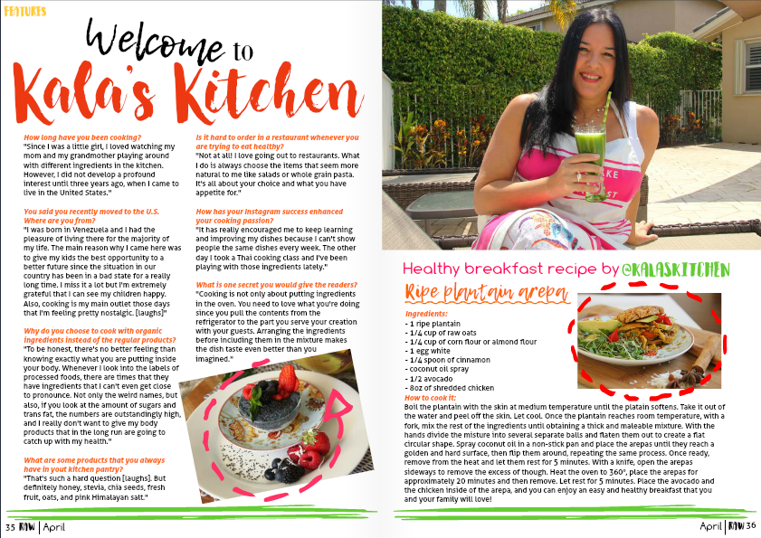
I love that picture of my mom because she looks happy and radiant, also she's wearing a bright pink which I incorporated throughout the page in several small details like the arrow and the text below the image. Also, since she's drinking a green smoothie, I also managed to include the bright green in some details like the lines and the text. As you can see, I continued using the bottom details as I've been doing with the rest of the pages so it all has coherence and continuity.
As for my mom's picture, I might play with it by zooming in and eliminating the section of the house that shows in the background so it becomes less distracting.
I decided to use a white background because I feel that I've used too many pages with full-page backgrounds and I thought that the colors would pop out better in a white backdrop. I think that backgrounds need to be used effectively and not always, for example, I'm thinking on changing the background in the introduction of the interview because it just seems that it is too much with the image on the side already.
I'm almost ready!
-SP
jueves, 6 de abril de 2017
Tick Tock Tick Tock
I am freaking out a little bit because the deadline is so close and I'm so unsure of everything right now. I'm in the middle of the production facet of RAW and this is what I have so far. What I plan to do in this post is a deep analysis in everything I've done so far.
The introduction to the interview:

As you can see, there have been some major improvements and changes. I decided to change the colors in the left page because they correlate to the colors on the food in the consecutive page. Also, as you can see, I made the background picture a little bit more opaque so it wouldn't be distracting at the time of reading the words. I absolutely love the bottom details of the line and the page number, next to the name and issue of the magazine. As you will soon see, that is a constant as you flip through the pages of RAW. On the top left corner of the first page I identified the story as a features article, which is also stated in the table of contents that I will show below. I just think this allows the readers to be clear that what their reading is not a current article but a fun and interesting interview with a suburban mother/chef that adores to cook. As for the picture on the right I chose that primarily because you can clearly see the subject of the interview displaying a plate of her own creation (also my mom made it very clear that she had to approve whatever picture I was planning on placing in the magazine). I don't know yet how I feel about the text on that page... I don't know if it's distracting or if it's right. As for that, maybe I'll take it out or maybe not, I just find it fun to have a small sneak peak of what the interviewee could say in the following pages.
As I said before, this is the introduction to an interview. So, there are 2 following pages that need to be done after these two. Yup, that's a lot of work to do... Obviously I'm overdoing it but I cannot just leave it here without actually writing the article, for me, it feels wrong (meet my perfectionist side). On the following pages I want to write the interview and maybe adding one of my mom's recipes on the bottom of the second page. Honestly, that's just an idea that is subject to drastic change.
As for the table of contents (I'M IN LOVE WITH MY BABY):

Honestly, if anyone doesn't like it, I don't need to hear it. I adore my page, it just looks sophisticated, simple, organic, it looks RAW. This is the perfect portrayal of what I envisioned. Obviously inspiration is a major key... in this case it came from this image.

As you can see, they both embody similar but different ideas. What I changed was not only the color of the pasta but in my picture the pasta is made out only of red and black beans which adds to my theme of organic products. Also, I included more variety of vegetables and drops of salt to add depth and white color to the background. As you can see, the yellow color of the pepper is extremely bright so I connected it with the title of the magazine located on the first page in order for the colors to have combination and make sense. The line between the page numbers is broken so it appears to be scraps on the board made by knives or cooking. Another detail that I adore is the "Table Of Contents" title located on the left page on top of the kitchen towel, specially because it merges with the picture without obstructing any section of the image.
There are many magazines that decide to have several pages of table of contents, displaying their features stories in one page and the rest of the articles in the consecutive pages. RAW follows these conventions. The table of contents that I created is mainly for the most prominent feature stories in the magazine while the rest of the table of contents will be located behind this double-page spread. As an example of this convention here is National Geographic and Rolling Stones.


Okay guys, see you really soon with more updated and new pages...
-SP
domingo, 2 de abril de 2017
No time
This weekend was and is still going to be hectic. I need to take all of my pictures but I literally have no time. Also, I have a burrowed camera, which I have to return by Monday. Adding o my problems, I have a wedding on Saturday that starts at 2:00pm until very late at night and on Sunday I work at 1:00pm through midnight... So yeah, I don't know what to do.
Anyways, on Friday night, I, very diligently, set up my alarm at 10:00am to wake up on Saturday a go straight to take the pictures. However, I unintentionally opened my eyes at 9:00am and couldn't go back to sleep with the thought of all the things I had to do.
I had a humongous fight with the camera because I don't know how to use it, but I managed to make it work for me. I took around 400 pictures to 5 different objects... That shows how much of a perfectionist I am.
Here are some of the results:


And this is me taking the pictures:


This project is making me anxious!
-SP
A problem sequence
On Wednesday I was panicking a little bit because I don't have a professional camera to take the pictures. After making a quick survey to all of my friends, turns out, none of them have a camera that I can burrow. I was neglected in using the iPhone camera because I wanted the pictures to be perfect and with the proper quality. Honestly, I had given up until I was in my newspaper class and one girl signed out one of the 3 cameras that the school provided for the newspaper and yearbook class. It was THE "aha moment" I had been waiting for... I, very politely, approached my teacher, Mr. Shannon, and asked to burrow one of the cameras for the weekend for my AICE Media Studies class, when he said yes the big weight on my shoulders faded away. I was happy again.

Readers, don't be too excited because I have another problem... I don't know how to use a professional camera! Hopefully these two articles have my answers. Thanks again Google.
I'll show you my pictures next post.
-SP

Readers, don't be too excited because I have another problem... I don't know how to use a professional camera! Hopefully these two articles have my answers. Thanks again Google.
I'll show you my pictures next post.
-SP
martes, 28 de marzo de 2017
Do you like it?
So, this week I've made a little bit more progress on the actual magazine pages. Yesterday I felt amazingly attached to Joomag.com and this is what I have managed to create.
The cover has not a lot of progress because I haven't taken the pictures yet, but the masthead and the border lines are going to be present surely. What I like about the lines is that they enclose the picture better and focus the reader's eyes into the center of the page. Now, consequently I will need to focus the food towards the center of the frame when I take the pictures. The lines are not sharp, which again goes with the theme of the magazine. For the color of the masthead, it's still undefined. Also, I need to figure out if I want to do cover lines, and if I do, what font to use. At the end, this page is EXTREMELY a rough draft... I just posted it to show you what I have been envisioning.


As you can see, the doodled lines and unsharp font is a recurring theme throughout the magazine, since it goes with the RAW masthead and genre. I took the background picture yesterday in my backyard, but I don't know yet if I want it to be an actual plant or vegetable leaves like lettuce, arugula, basil, mint, etc. I thought of the plants because the other page is going to be completely covered by a picture of my mom in the kitchen, so the kitchen and the plant background would give a feeling of a home environment to the following interview. Since the subject of the interview is not a professional chef but more like a suburban mother/cook, I want the audience to feel the connection to home and as if they were reading an interview from their next-door neighbor.
These are some of the pictures that I took and edited in my iPhone:


This process is extremely difficult because, even though I know it looks good, I always feel that I need outside opinions. Until now I've asked around 12 different persons but I need a critical eye to evaluate my pages. I need someone that will tell me move this, take out that, change this... But obviously I don't have any magazine expert friends, it's all on me and my non-expert and barely critical friends. I trust myself but at the end of the day, I'm not the only reader that will obtain the magazine... I NEED OPINIONS PLEASE!
See you soon!
-SP
The cover has not a lot of progress because I haven't taken the pictures yet, but the masthead and the border lines are going to be present surely. What I like about the lines is that they enclose the picture better and focus the reader's eyes into the center of the page. Now, consequently I will need to focus the food towards the center of the frame when I take the pictures. The lines are not sharp, which again goes with the theme of the magazine. For the color of the masthead, it's still undefined. Also, I need to figure out if I want to do cover lines, and if I do, what font to use. At the end, this page is EXTREMELY a rough draft... I just posted it to show you what I have been envisioning.

Remember that 4-page interview I mentioned in my previous post? This is somewhat how I want the first two pages to look.

As you can see, the doodled lines and unsharp font is a recurring theme throughout the magazine, since it goes with the RAW masthead and genre. I took the background picture yesterday in my backyard, but I don't know yet if I want it to be an actual plant or vegetable leaves like lettuce, arugula, basil, mint, etc. I thought of the plants because the other page is going to be completely covered by a picture of my mom in the kitchen, so the kitchen and the plant background would give a feeling of a home environment to the following interview. Since the subject of the interview is not a professional chef but more like a suburban mother/cook, I want the audience to feel the connection to home and as if they were reading an interview from their next-door neighbor.
These are some of the pictures that I took and edited in my iPhone:


This process is extremely difficult because, even though I know it looks good, I always feel that I need outside opinions. Until now I've asked around 12 different persons but I need a critical eye to evaluate my pages. I need someone that will tell me move this, take out that, change this... But obviously I don't have any magazine expert friends, it's all on me and my non-expert and barely critical friends. I trust myself but at the end of the day, I'm not the only reader that will obtain the magazine... I NEED OPINIONS PLEASE!
See you soon!
-SP
Suscribirse a:
Entradas (Atom)